THE BRIEF:
Wipe Out Magazine is one of the leading surf magazines in the world. They are looking for a fresh new look and feel for their magazine.
The magazine is packed full of interviews with some of the most reputable and legendary surfers from across the globe, as well as the freshest surf grams, boards and equipment.
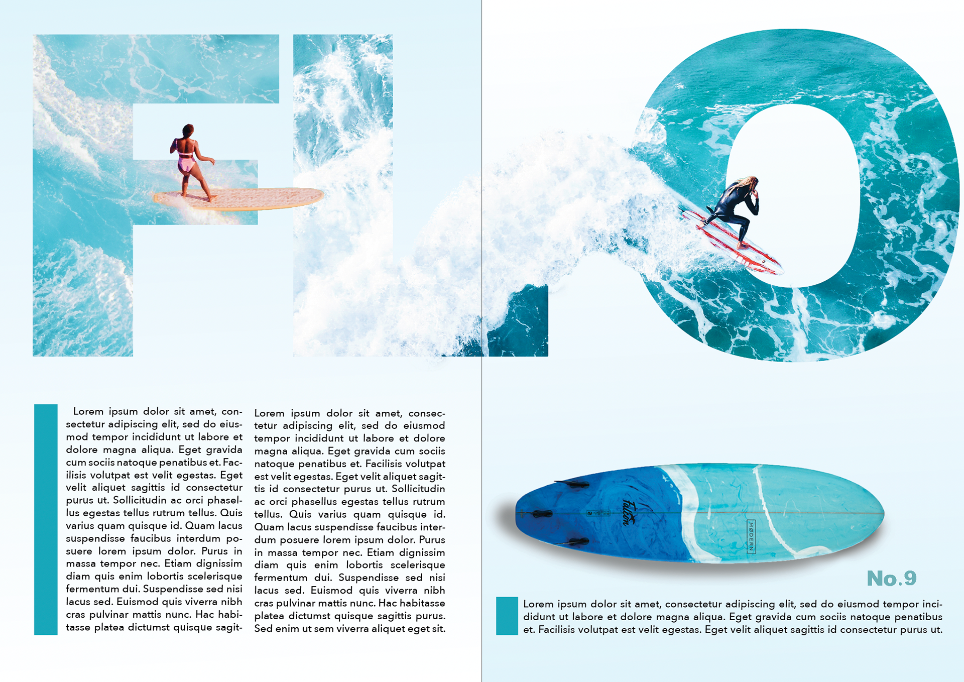
To appeal to both the younger and older demographics, they want the design to feel stylish and fashionable, but with an old-school twist. To get an idea of the creative direction, they would like to see a double page magazine spread, with a clear and defined route for the design which they will then plan to roll out across their magazine for 2020 and 2021. They are open-minded to the content you choose to include in the designs, as at this stage the focus is on the aesthetic. The only requirements is it must include action-based images of surfers - so, no images of surfers walking down the beach - and clear defined styles for main titles, sub headers, body text and pull quotes.
Wipe Out Magazine has an adrenaline fueled brand personality, and they want to convey this feeling in the new design style.
The magazine is packed full of interviews with some of the most reputable and legendary surfers from across the globe, as well as the freshest surf grams, boards and equipment.
To appeal to both the younger and older demographics, they want the design to feel stylish and fashionable, but with an old-school twist. To get an idea of the creative direction, they would like to see a double page magazine spread, with a clear and defined route for the design which they will then plan to roll out across their magazine for 2020 and 2021. They are open-minded to the content you choose to include in the designs, as at this stage the focus is on the aesthetic. The only requirements is it must include action-based images of surfers - so, no images of surfers walking down the beach - and clear defined styles for main titles, sub headers, body text and pull quotes.
Wipe Out Magazine has an adrenaline fueled brand personality, and they want to convey this feeling in the new design style.
This is a full color, printed magazine.
Process:
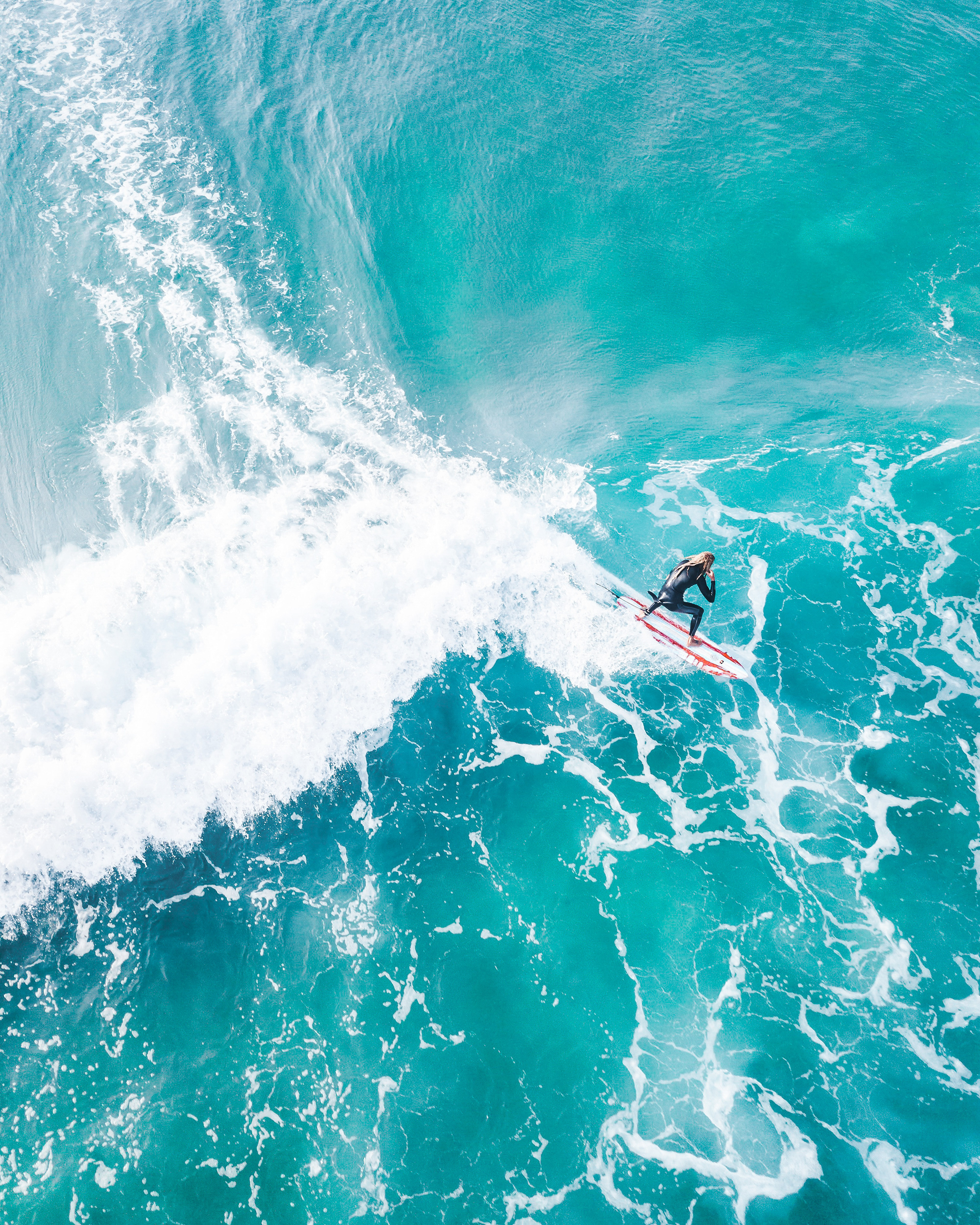
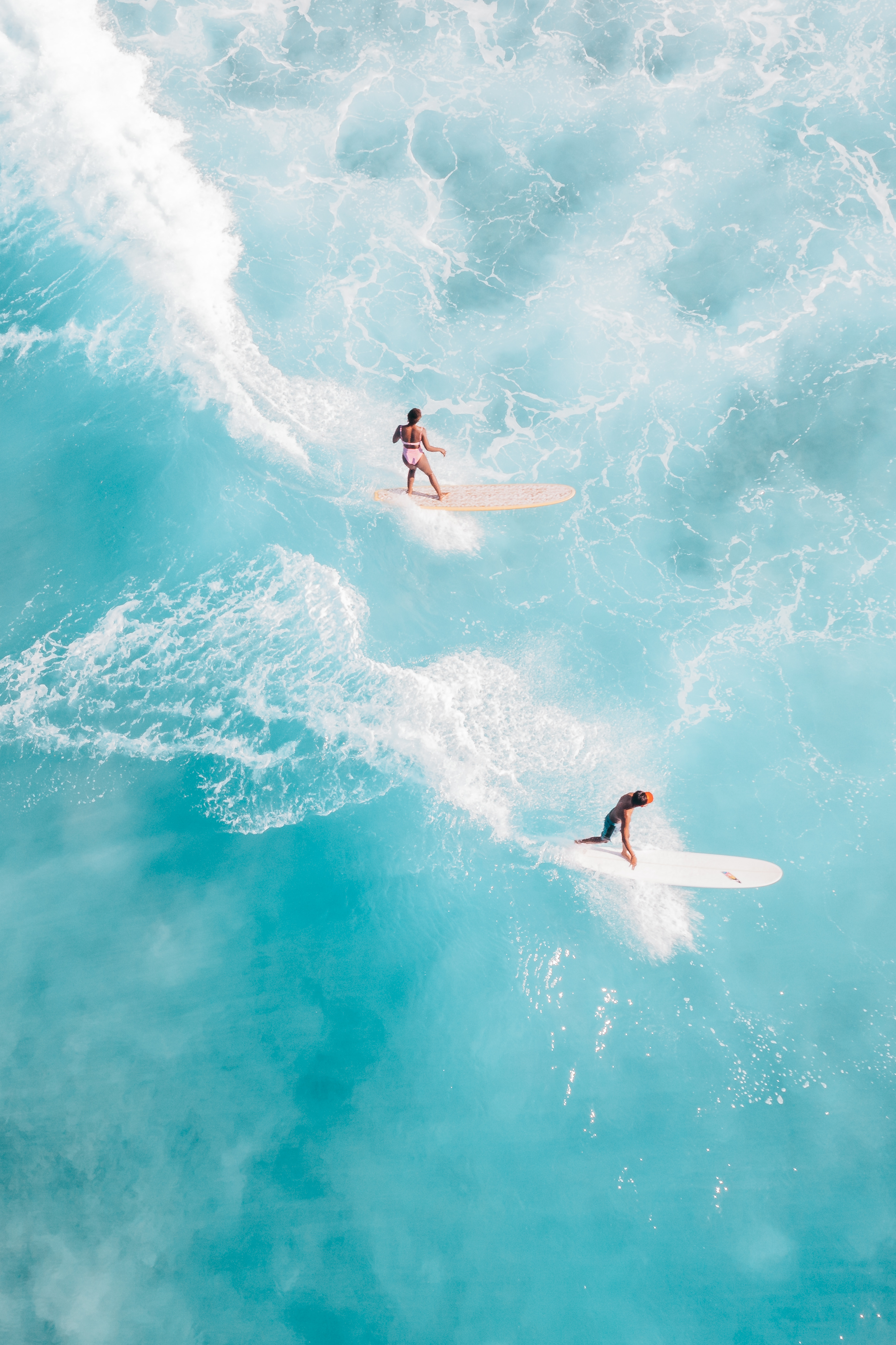
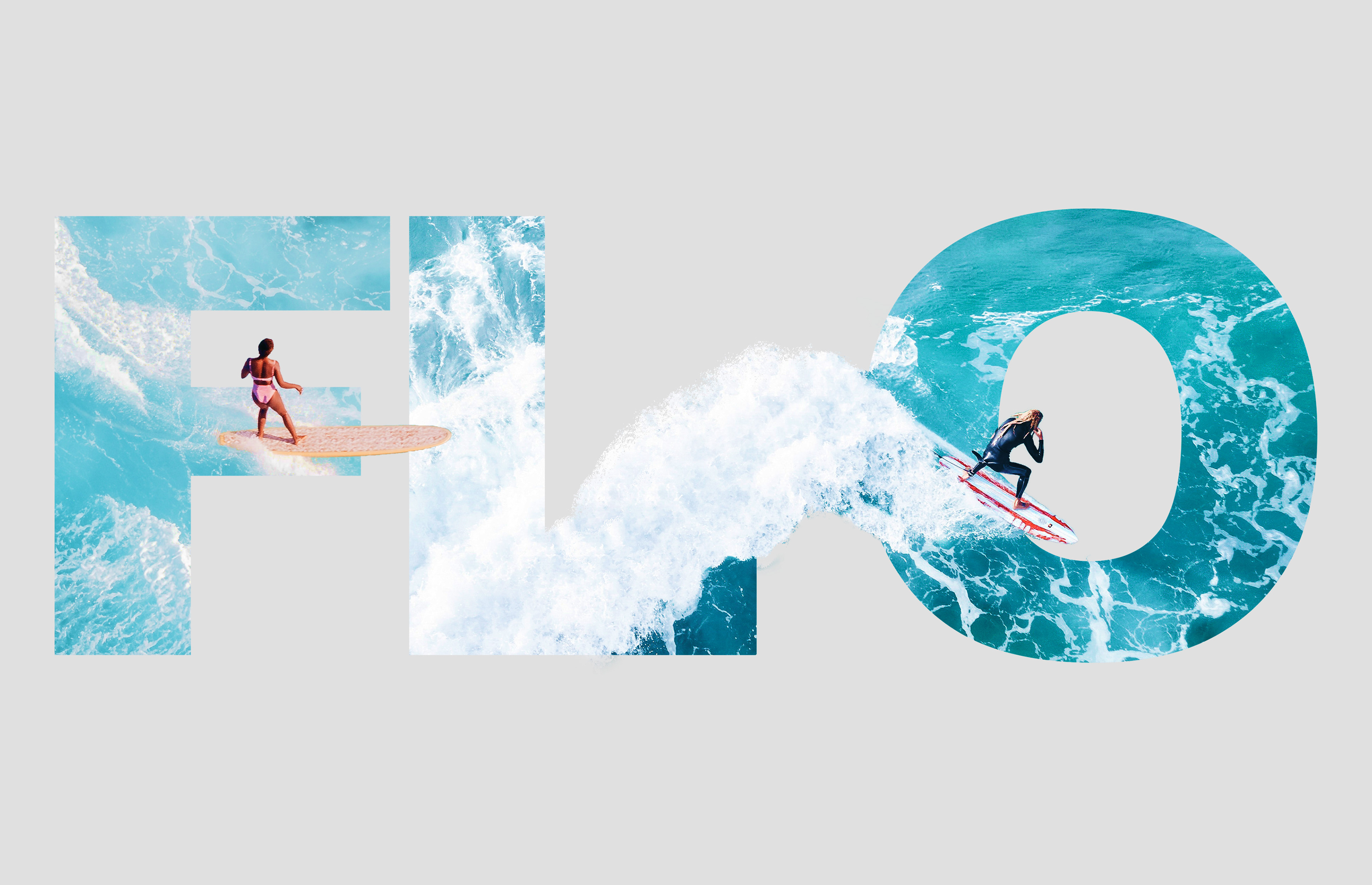
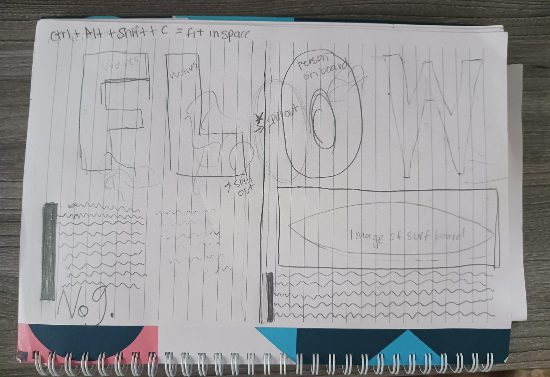
When I read through the brief I went to my sketch book and drew out my idea. After figuring out how I wanted the design to look, I then brought assets from the web into photoshop to make the design. Thinking big waves and remaining personable, I brought in surfers on their boards catching the waves to keep the design people-forward.
Images: Pexels
Images: Pexels